
What Is a Squeeze Page and How Does It Generate Leads
Uncover what is a squeeze page and its role in turning visitors into leads. Learn proven strategies, key elements, and inspiring examples to boost conversions.
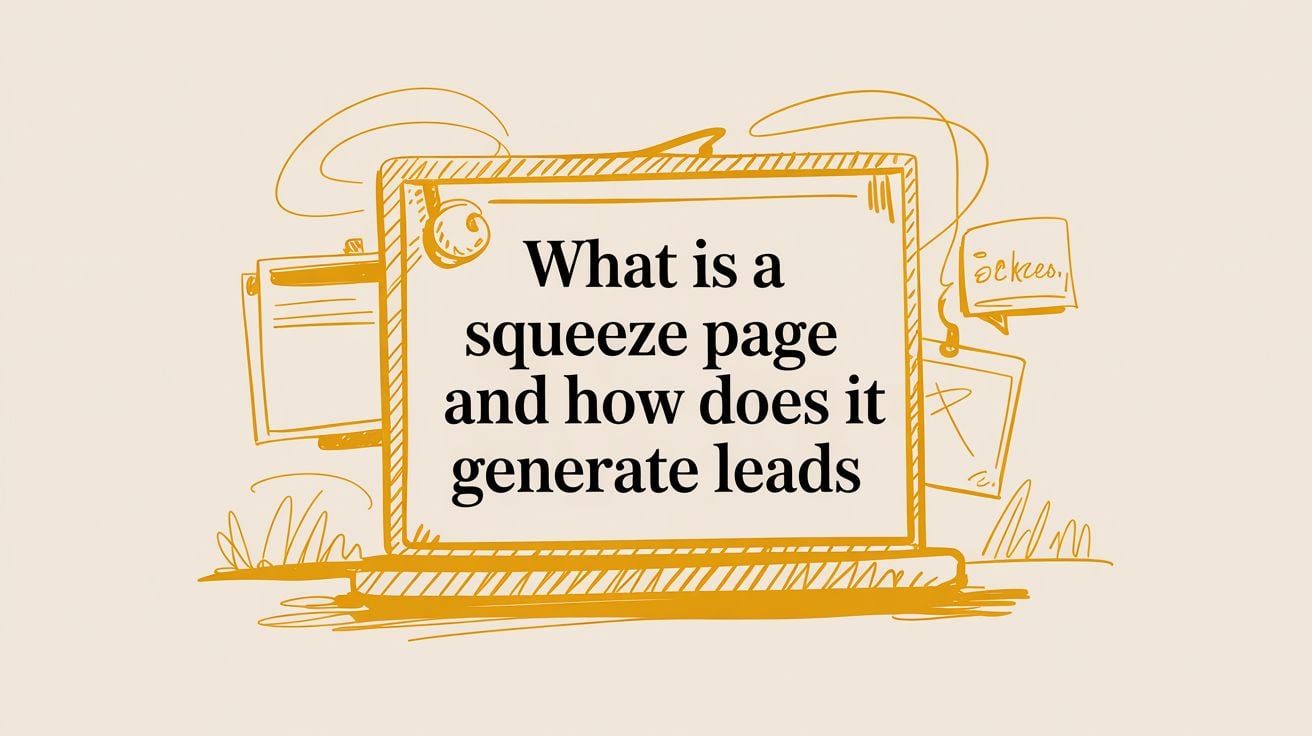
Think of a squeeze page as your most focused, most persuasive digital handshake. It’s a special kind of landing page, but with one crystal-clear mission: to capture a visitor’s email address. Nothing more, nothing less. It’s a simple, elegant exchange designed to trade something incredibly valuable for a direct line to your audience.
The Power of a Single, Focused Action
Imagine your main website is a sprawling, bustling marketplace. It's vibrant and full of energy, with dozens of stalls to visit—your blog, your product pages, your "About Us" story. Visitors are free to wander, explore, and get lost in all the interesting things you have to offer. But with all that freedom comes distraction.
A squeeze page is the complete opposite. It's a quiet, private room with a single chair and you, the friendly host.
In this space, there’s no confusion, no other doors, and no shiny objects competing for attention. The entire experience boils down to one simple, powerful conversation: "I created this amazing [checklist/e-book/video series] that will solve [a specific, nagging problem] for you. If that sounds good, just pop in your email, and I’ll send it straight to your inbox."
This singular focus is precisely what makes a squeeze page a secret weapon for creators, founders, and marketers. It ruthlessly strips away every non-essential element—no navigation bars, no sidebars, no distracting links. It’s all about channeling the visitor’s attention toward one single, high-value action. This isn't about closing a sale on the spot; it's about earning the privilege of starting a meaningful conversation.
Squeeze Page vs Traditional Landing Page
While both are types of landing pages, their jobs are quite different. Here’s a quick breakdown to see how a squeeze page’s laser focus sets it apart from a more general landing page.
| Feature | Squeeze Page | Traditional Landing Page |
|---|---|---|
| Primary Goal | Capture an email address | Drive a specific action (e.g., sale, demo request, download) |
| Content Length | Very short and to the point | Can be short or long, depending on the offer |
| Number of Links | One (the call-to-action button) | Can have multiple links, social proof, testimonials |
| Design Focus | Minimalist; removes all distractions | More complex; often includes navigation or footers |
As you can see, the beauty of the squeeze page is in its simplicity. It’s built for one thing and one thing only.
Building Your Community, One Email at a Time
When you capture that email, something magical happens. You’ve just turned a fleeting, anonymous visitor into a real, identifiable contact. This is the absolute first step in building an audience that knows, likes, and trusts you. Suddenly, you have a direct channel to:
- Nurture trust by consistently sharing valuable insights that prove you know your stuff.
- Announce new things and give your biggest fans a front-row seat for product launches or fresh content.
- Gather feedback by simply asking your most engaged followers what they’re struggling with.
- Drive future sales by introducing your offers to a warm audience that's already listening.
The minimalist design is entirely by design. It’s rooted in a powerful psychological principle: less choice leads to more action. And boy, does it work. While a typical landing page might see a median conversion rate of 6.6%, a well-crafted B2B squeeze page—perfect for a founder building that initial email list—can hit rates as high as 13.3%. If you’re curious to dig deeper, you can find more great landing page statistics and benchmarks on involve.me.
This graphic really drives home the difference in focus between a full website and a dedicated squeeze page.

As the diagram shows, a website is designed to serve many masters and many goals. A squeeze page, on the other hand, is engineered for one glorious purpose: turning passing traffic into lifelong fans.
The Anatomy of a High-Converting Squeeze Page

Think of a squeeze page less like a traditional webpage and more like a focused, persuasive conversation. Every single element has a job to do. Each piece is there to build trust, spark curiosity, and guide your visitor toward one simple, confident "yes."
Let’s pull back the curtain and look at the essential parts that work together to turn a casual passerby into an enthusiastic subscriber.
At the center of it all is the irresistible offer, what we marketers call a lead magnet. This is much more than just a free download; it's a specific solution to a real problem your ideal customer is wrestling with right now. A fantastic lead magnet provides an immediate, valuable win.
This offer is the entire reason your squeeze page exists. It’s why someone would gladly give you their email address. It’s how you prove, in an instant, that you get them and you're here to help.
The Core Building Blocks of Persuasion
To make your offer shine, you need a few key elements working in perfect harmony. Each one plays a part in building momentum, making the choice to sign up feel both easy and smart.
- A Magnetic Headline: This is your first impression. It has to grab their attention immediately and promise a clear, exciting benefit. Forget "Sign Up for Our Newsletter." Think more along the lines of, "The 5-Minute Checklist to Double Your Daily Productivity." See the difference?
- Benefit-Driven Copy: Keep your text short, punchy, and focused entirely on the outcome. A few sharp sentences or bullet points should explain the transformation your lead magnet delivers. Don't just list features; describe what they will feel or achieve once they have it.
- A Striking Visual: People are visual creatures. A simple image—like a mockup of your ebook cover or a snapshot of your checklist—makes your digital offer feel real and tangible. It helps your visitor picture the value they’re about to get.
These pieces set the stage. They create an emotional hook and give your visitor a logical reason to lean in and take the next step. Once you’ve got their interest, the rest of the process needs to be completely seamless.
"The purpose of a squeeze page is to be a master of one trade, not a jack of all. Its singular focus on capturing an email is its greatest strength, removing decision fatigue and making the user’s next step crystal clear."
The Final Push to Action
The last few components are all about making your request simple and compelling. This is where so many pages stumble—they either ask for too much information or fail to make the final action obvious.
A great squeeze page finishes strong with a simple, single-field opt-in form. Remember this: every extra field you ask for (like a first name, phone number, or company) is another reason for someone to walk away. For a squeeze page, an email address is all you really need. To dive deeper into this, check out our guide on how to design high-converting opt-in forms.
Finally, your call-to-action (CTA) button is the exclamation point at the end of your persuasive sentence. Use clear, action-focused text that reminds them of the benefit. Ditch the boring "Submit" button and go for something exciting like "Get My Free Guide!" or "Send Me the Cheatsheet!" It’s a small change that makes a world of difference.
Alright, let's breathe some life into this section. Here’s a rewrite that feels more like a seasoned pro sharing what they've learned from years in the marketing trenches.
How to Get Way More Sign-Ups From Your Squeeze Page
You've built your squeeze page. That’s a huge first step—congratulations! But now for the fun part: turning that page from just a 'page' into a powerhouse that brings people into your world. A few simple tweaks can be the difference between a trickle of sign-ups and a flood of new, excited subscribers. These aren't complicated tricks; they're just smart, time-tested principles that work with people, not against them.
The single biggest change you can make? Be ruthless about simplicity. Your squeeze page has one, and only one, goal. Anything that doesn't directly lead to a sign-up is just noise. That means it’s time to say goodbye to your navigation menu, the footer, and yes, even your social media links.
Giving visitors too many options or "exit ramps" just gives them a reason to click away. By creating a single, focused path, you make the decision to join your list feel like the most natural, obvious next step. It might feel a little bold to strip everything away, but this is the secret behind the squeeze pages that consistently get incredible results.
Earn Their Trust in a Heartbeat
Once you have their undivided attention, the next job is to build trust—fast. This is where social proof becomes your superpower. Think of it like walking down the street and seeing a long line outside a coffee shop. You immediately think, "Wow, that place must be good!" Social proof does the same thing for your squeeze page.
The best squeeze pages don't just ask for an email address; they earn it. You're showing visitors that others have already put their trust in you, giving them the confidence to take that small leap of faith and become part of your community.
You can create this effect with a few simple additions:
- Testimonials: Just a quick quote from someone who absolutely loved your freebie can work wonders.
- Subscriber Counts: A simple line like, "Join 1,500+ other smart marketers" instantly builds a sense of belonging.
- "As Seen On" Logos: Have you been featured anywhere? Showcase those logos! It’s a powerful, visual stamp of approval.
Even one small, well-placed piece of social proof can be the nudge that turns a hesitant visitor into an enthusiastic new subscriber.
Make it Fast and Flawless on Mobile
Let's face it: most of your audience will find your page on their phone, probably while waiting in line or scrolling during a commercial break. Your squeeze page absolutely has to meet them there. Optimizing for mobile and making sure your page loads lightning-fast isn't just a "nice-to-have" anymore; it's a must.
This is where squeeze pages truly excel. While mobile devices are king, driving 83% of all traffic, they usually have lower conversion rates. But a well-designed, responsive squeeze page can completely turn that around, sometimes hitting conversion rates as high as 19.3%.
Speed is just as crucial. A page that loads in one second can enjoy a 9.6% conversion rate, but that number drops to a painful 3.3% if it takes five seconds. That data makes it crystal clear: every single second matters. If you want to dive deeper, there's some fascinating information on conversion rate optimization over at BloggingWizard. A fast, clean mobile experience shows you respect your visitor's time and makes sure you don't lose good people to a slow-loading page.
Inspiring Squeeze Page Examples That Work
It's one thing to talk about theory, but seeing these ideas come alive in the real world is where the magic truly happens. A great squeeze page isn't just a jumble of marketing elements; it's the start of a meaningful conversation. To really help you connect the dots, let's pull back the curtain on a few brilliant examples and see what makes them tick.
We're going to go beyond a surface-level glance. We'll dive into the headlines, the offers, the copy, and the design choices. Think of it as looking over my shoulder as we explore how smart founders, creators, and even big brands use these simple pages to build incredible audiences.
The SaaS Pre-Launch List
For a solo developer or an early-stage SaaS founder, a squeeze page is your best friend. It’s the perfect, low-cost way to see if your big idea has legs and to build an eager waitlist before you’ve even written a line of code.
- The Headline: It usually hits you with a direct, powerful question that zeroes in on a very specific frustration. Think something like, "Tired of Juggling Five Different Project Tools Just to Stay Organized?"
- The Offer: Here, the promise isn't a PDF download. It’s something far more enticing: early access, a special launch-day discount, or even the opportunity to help shape the product's future.
- The Copy: The language is lean and focused. It doesn't waste words. It just highlights the core problem and paints a picture of the future solution, building a sense of anticipation for what's to come.
- Why It Works: This strategy doesn't just collect emails; it creates a founding tribe. You end up with a group of highly motivated, emotionally invested followers who are genuinely excited for your next move.
The most inspiring squeeze pages don't just ask for an email; they offer entry into a story. For a founder, it’s the story of building something new. For a creator, it’s the story of mastering a skill.
The Creator's Free Course
You’ll see this everywhere with content creators and experts, and for good reason. They often use squeeze pages to offer a free email course or a video series. This is a classic, powerful strategy because it delivers massive value right away and builds instant trust.
This sketch shows how different business models can adapt the squeeze page concept.

As you can see, the fundamental idea—trading immense value for an email address—is incredibly versatile. It can be tailored for completely different goals, from testing a software idea to exploding a creator's audience.
The Brand's Webinar Registration
Even established brands lean on squeeze pages, especially for driving sign-ups for webinars and live online events. The psychology here shifts slightly towards urgency and authority. The page is designed to sell the immense value of attending the live session, often highlighting the exclusive insights that will be shared by respected industry leaders.
This turns a simple registration form into a can't-miss appointment with a trusted expert. In doing so, it generates a high-quality lead who is already warmed up and ready to hear about the brand's deeper solutions.
How to Build Your First Squeeze Page in Minutes
The most powerful marketing tools aren't the most complicated ones—they're the ones you actually use. It’s so easy to see inspiring examples and think, “I really need to do that someday.” But what if someday could be today?
Building your first squeeze page isn’t some monumental technical challenge. It’s a simple, empowering step you can take right now, in just a few minutes, to finally start building your audience.
Forget the myth that you need to be a coder or a high-priced designer. Modern tools are made for entrepreneurs and creators like you, with simple drag-and-drop interfaces that make the whole process feel like child's play. Your goal today isn't perfection. It's action.
From Idea to Live Page in Three Simple Steps
That journey from a concept in your head to a live, working page is way shorter than you think. It's all about taking that one small step that builds momentum for the next one. Here’s a quick-start guide to get you there.
Choose a Proven Template: Don't even think about starting from a blank screen. Most page builders, like Leadpages or Instapage, offer a library of high-converting squeeze page templates. Just pick one with a clean, simple design that feels right for your brand. This one decision saves you hours of guesswork.
Customize Your Message: This is where you breathe life into your offer. Write that irresistible headline, pop in a few bullet points that scream “you need this,” and upload an image of your lead magnet. Tools like Build Emotion even have guided prompts to help you write copy that truly connects.
Connect and Publish: The final piece of the puzzle is linking your email service provider (think Mailchimp or ConvertKit) and hitting that big, beautiful "publish" button. That’s it. You officially have a live squeeze page working for you 24/7.
The real win isn’t just having a squeeze page. It's the feeling you get after you build it. You’ve transformed a good idea into a tangible asset, igniting a spark of marketing momentum that’s hard to extinguish.
Turn That Spark into a Fire
Once your page is live, you’ve done more than just complete a task—you’ve started a powerful habit. You’ve taken a direct step toward building the audience you’ve always wanted.
This single action proves you can turn ideas into reality, which makes it so much easier to take the next step, and the one after that. This is how marketing stops being a scary, overwhelming project and becomes a consistent, daily practice.
The process is surprisingly straightforward, especially if you're building on a platform you already know. For instance, if you're comfortable with your website's backend, our guide on how to create a landing page in WordPress can give you even more specific pointers.
The key is to start small, get that first win, and let that incredible energy carry you forward.
How to Measure Success and Optimize for Growth
Getting your squeeze page live is a huge win, but it’s just the beginning of the journey, not the end. Think of it less like a finished painting and more like a living garden. It needs attention to flourish. To make it truly thrive, you have to stop guessing and start listening to what your audience is telling you through their actions.
It's easy to get caught up in flashy numbers like total page views. But traffic alone doesn't pay the bills. The one metric that truly moves the needle is your conversion rate. This is the number that tells you, in no uncertain terms, how good your page is at its one job: getting that email address.
Finding Your True North Metric
Figuring out your conversion rate is refreshingly simple. Just take the number of people who signed up, divide it by the total number of unique visitors, and multiply that by 100.
(Number of Sign-ups / Total Visitors) x 100 = Conversion Rate %
Let's say 100 people land on your page and 15 of them sign up. Boom—you have a 15% conversion rate. That’s a fantastic result, by the way. This single percentage is your compass. It guides you, telling you whether your headline is hitting the mark, if your offer is irresistible, and if your design feels trustworthy.
While it’s helpful to know that most squeeze pages convert somewhere between 5% and 20%, the only benchmark that really matters is your own. Your goal is simple: beat yesterday's number. Continuous improvement is the name of the game.
Turn Data into Inspired Action
Once you have that core number, the real fun begins. It's time to dig into why it is what it is. With simple analytics tools that take just minutes to set up, you can start connecting the dots. You can literally see where your best, most engaged subscribers are coming from.
- Are they pouring in from that one viral social media post?
- Did that guest article you wrote for another blog send a wave of new fans?
- Or maybe they’re finding you through a startup directory you almost forgot you submitted to.
This creates an incredibly powerful feedback loop. Instead of throwing marketing spaghetti at the wall to see what sticks, your data points you directly to what’s already working. It turns your marketing from a shot in the dark into a predictable, momentum-building system. And honestly, there’s nothing more inspiring than seeing clear results from your hard work.
If you’re ready to go deeper and connect all your marketing actions to real, tangible outcomes, our guide on how to measure marketing efforts is the perfect next step.
Frequently Asked Questions
As you start pulling all these pieces together to build an audience you can be proud of, a few questions always pop up. Let's tackle them head-on so you can move forward with total clarity and start watching those sign-ups come in.
How Is a Squeeze Page Different From a Homepage?
Think of your homepage as the grand entrance to your digital home. It has a big, welcoming front door and is designed to show people around. It points them to the blog, your services, the "about me" story—it's a hub meant to guide visitors to many different places.
A squeeze page, on the other hand, is more like a quiet side room with just one chair and one door. It’s built for a single, focused conversation. Every distraction, like navigation bars or extra links, is stripped away. The goal is laser-focused on one action: trading an amazing freebie for an email address. This intense focus is exactly why they convert so incredibly well.
What Kind of Free Offer Should I Create?
The best offers—what we call lead magnets—solve a very specific, nagging problem for the person you want to attract. The magic here is to think small but mighty. You're not trying to write a 100-page encyclopedia; you’re aiming to deliver a quick, satisfying win that makes someone say, "Wow, this is exactly what I needed."
The perfect lead magnet feels like a secret tool. It gives your new subscriber an immediate advantage and proves that you understand their world. It’s an instant "aha!" moment that builds immediate trust.
Here are a few ideas that work wonders:
- For a SaaS product: A simple checklist like "5 Costly Mistakes to Avoid in [Your Niche]."
- For a developer tool: A genuinely useful code snippet or a ready-to-use configuration template.
- For a creative service: A curated list of top-tier, free resources or a one-page "inspiration board."
Start with something you can put together in just a few hours. A simple one-page PDF is often more than enough to get the ball rolling and build real momentum.
Do I Need a Squeeze Page If I Have a Newsletter Form?
Yes, you absolutely do. A standard newsletter form tucked away on your blog or in your footer usually has a pretty weak pitch: "Sign up for my newsletter." It's passive, uninspiring, and easy for people to ignore.
A squeeze page flips the script entirely. It makes a powerful, specific promise: "Get this exclusive guide to solve this exact problem." Because the offer is so targeted and genuinely helpful, a dedicated squeeze page will turn visitors into subscribers at a much, much higher rate. It gives you a dedicated place to send traffic, ensuring you’re maximizing every single visit.
Ready to stop guessing and start building? Build Emotion is the practical marketing system for founders who want to turn daily actions into visible progress. It provides the clarity and tools to build a consistent marketing habit that compounds into awareness, trust, and growth. Start building your audience today.